Axes and labels in R
Axes and Text
Many high level plotting functions (plot, hist, boxplot, etc.) allow you to include axis and text options (as well as other graphical parameters). For example:
 # Specify axis options within plot()
plot(x, y, main="title", sub="subtitle",
  xlab="X-axis label", ylab="y-axix label",
  xlim=c(xmin, xmax), ylim=c(ymin, ymax))
For finer control or for modularization, you can use the functions described below.
Titles
Use the title( ) function to add labels to a plot.
title(main="main title", sub="sub-title",
 xlab="x-axis label", ylab="y-axis label")
Many other graphical parameters (such as text size, font, rotation, and color) can also be specified in the title( ) function.
# Add a red title and a blue subtitle. Make x and y
# labels 25% smaller than the default and green.
title(main="My Title", col.main="red",
  sub="My Sub-title", col.sub="blue",
  xlab="My X label", ylab="My Y label",
  col.lab="green", cex.lab=0.75)
Text Annotations
Text can be added to graphs using the text( ) and mtext( ) functions. text( ) places text within the graph while mtext( ) places text in one of the four margins.
text(location, "text to place", pos, ...)
mtext("text to place", side, line=n, ...)
Common options are described below.
| option | description |
| location | location can be an x,y coordinate. Alternatively, the text can be placed interactively via mouse by specifying location as locator(1). |
| pos | position relative to location. 1=below, 2=left, 3=above, 4=right. If you specify pos , you can specify offset= in percent of character width. |
| side | which margin to place text. 1=bottom, 2=left, 3=top, 4=right. you can specify line= to indicate the line in the margin starting with 0 and moving out. you can also specify adj=0 for left/bottom alignment or adj=1 for top/right alignment. |
Other common options are cex , col, and font (for size, color, and font style respectively).
Labeling points
You can use the text( ) function (see above) for labeling point as well as for adding other text annotations. Specify location as a set of x, y coordinates and specify the text to place as a vector of labels. The x, y, and label vectors should all be the same length.
# Example of labeling points
attach(mtcars)
plot(wt, mpg, main="Milage vs. Car Weight",
  xlab="Weight", ylab="Mileage", pch=18, col="blue")
text(wt, mpg, row.names(mtcars), cex=0.6, pos=4, col="red")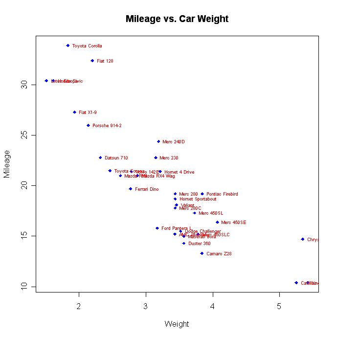
Math Annotations
You can add mathematically formulas to a graph using TEX-like rules. See help(plotmath) for details and examples.
Axes
You can create custom axes using the axis( ) function.
axis(side, at=, labels=, pos=, lty=, col=, las=, tck=, ...)
where
| option | description |
| side | an integer indicating the side of the graph to draw the axis (1=bottom, 2=left, 3=top, 4=right) |
| at | a numeric vector indicating where tic marks should be drawn |
| labels | a character vector of labels to be placed at the tickmarks (if NULL, the at values will be used) |
| pos | the coordinate at which the axis line is to be drawn. (i.e., the value on the other axis where it crosses) |
| lty | line type |
| col | the line and tick mark color |
| las | labels are parallel (=0) or perpendicular(=2) to axis |
| tck | length of tick mark as fraction of plotting region (negative number is outside graph, positive number is inside, 0 suppresses ticks, 1 creates gridlines) default is -0.01 |
| (...) | other graphical parameters |
If you are going to create a custom axis, you should suppress the axis automatically generated by your high level plotting function. The option axes=FALSE suppresses both x and y axes. xaxt="n" and yaxt="n" suppress the x and y axis respectively. Here is a (somewhat overblown) example.
# A Silly Axis Example

# specify the data
x <- c(1:10); y <- x; z <- 10/x

# create extra margin room on the right for an axis
par(mar=c(5, 4, 4, 8) + 0.1)

# plot x vs. y
plot(x, y,type="b", pch=21, col="red",
  yaxt="n", lty=3, xlab="", ylab="")

# add x vs. 1/x
lines(x, z, type="b", pch=22, col="blue", lty=2)

# draw an axis on the left
axis(2, at=x,labels=x, col.axis="red", las=2)

# draw an axis on the right, with smaller text and ticks
axis(4, at=z,labels=round(z,digits=2),
  col.axis="blue", las=2, cex.axis=0.7, tck=-.01)

# add a title for the right axis
mtext("y=1/x", side=4, line=3, cex.lab=1,las=2, col="blue")

# add a main title and bottom and left axis labels
title("An Example of Creative Axes", xlab="X values",
  ylab="Y=X")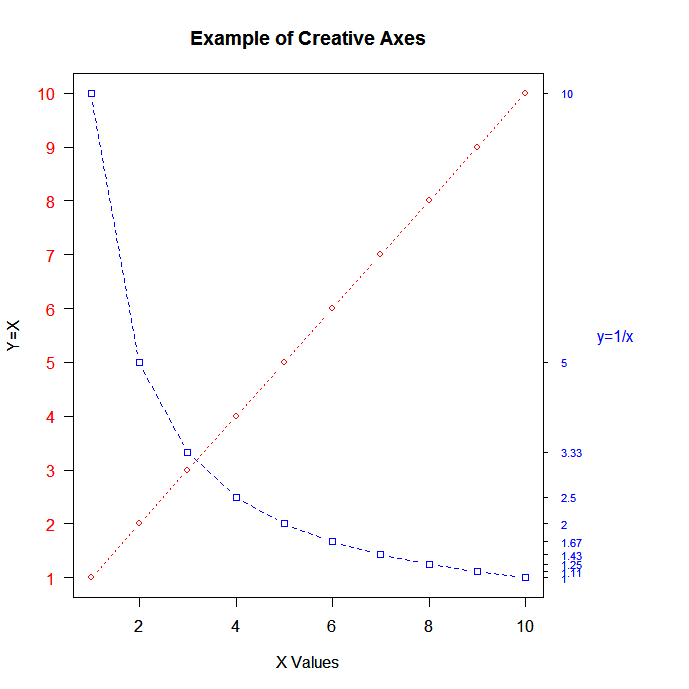
Minor Tick Marks
The minor.tick( ) function in the Hmisc package adds minor tick marks.
# Add minor tick marks
library(Hmisc)
minor.tick(nx=n, ny=n, tick.ratio=n)
nx is the number of minor tick marks to place between x-axis major tick marks.ny does the same for the y-axis. tick.ratio is the size of the minor tick mark relative to the major tick mark. The length of the major tick mark is retrieved from par("tck").
Reference Lines
Add reference lines to a graph using the abline( ) function.
abline(h=yvalues, v=xvalues)Other graphical parameters (such as line type, color, and width) can also be specified in the abline( ) function.
# add solid horizontal lines at y=1,5,7
abline(h=c(1,5,7))
# add dashed blue verical lines at x = 1,3,5,7,9
abline(v=seq(1,10,2),lty=2,col="blue")
Note: You can also use thegrid( )function to add reference lines.
Legend
Add a legend with the legend() function.
legend(location, title, legend, ...)

Common options are described below.
| option | description |
| location | There are several ways to indicate the location of the legend. You can give an x,y coordinate for the upper left hand corner of the legend. You can use locator(1), in which case you use the mouse to indicate the location of the legend. You can also use the keywords"bottom", "bottomleft", "left", "topleft", "top", "topright", "right", "bottomright", or "center". If you use a keyword, you may want to use inset= to specify an amount to move the legend into the graph (as fraction of plot region). |
| title | A character string for the legend title (optional) |
| legend | A character vector with the labels |
| ... | Other options. If the legend labels colored lines, specify col= and a vector of colors. If the legend labels point symbols, specify pch= and a vector of point symbols. If the legend labels line width or line style, use lwd= or lty= and a vector of widths or styles. To create colored boxes for the legend (common in bar, box, or pie charts), use fill= and a vector of colors. |
Other common legend options include bty for box type, bg for background color, cex for size, and text.col for text color. Setting horiz=TRUE sets the legend horizontally rather than vertically.
# Legend Example
attach(mtcars)
boxplot(mpg~cyl, main="Milage by Car Weight",
  yaxt="n", xlab="Milage", horizontal=TRUE,
  col=terrain.colors(3))
legend("topright", inset=.05, title="Number of Cylinders",
  c("4","6","8"), fill=terrain.colors(3), horiz=TRUE)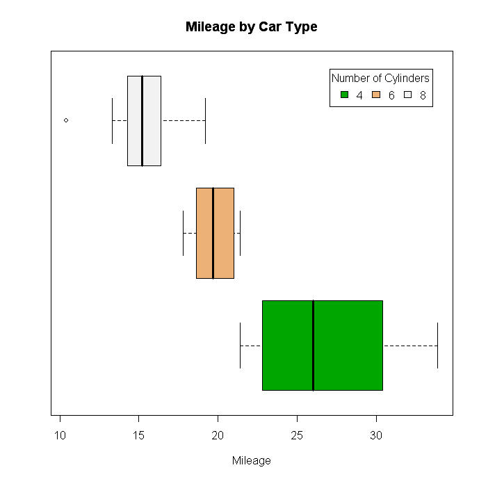
For more on legends, see help(legend). The examples in the help are particularly informative.
To Practice
Try the free first chapter of this online data visualization course in R.


blog
The 4 Best Data Analytics Bootcamps in 2024
Kevin Babitz
5 min
blog
A Guide to Corporate Data Analytics Training
Kevin Babitz
6 min

podcast
[Radar Recap] Scaling Data ROI: Driving Analytics Adoption Within Your Organization with Laura Gent Felker, Omar Khawaja and Tiffany Perkins-Munn

Richie Cotton
40 min
tutorial
How to Transpose a Matrix in R: A Quick Tutorial

Adel Nehme
code-along
Getting Started With Data Analysis in Alteryx Cloud

Joshua Burkhow