Layout and combining plots in R
Combining Plots
R makes it easy to combine multiple plots into one overall graph, using either thepar( ) or layout( ) function.
With the par( ) function, you can include the option mfrow=c(nrows, ncols) to create a matrix of nrows x ncols plots that are filled in by row. mfcol=c(nrows, ncols) fills in the matrix by columns.
# 4 figures arranged in 2 rows and 2 columns
attach(mtcars)
par(mfrow=c(2,2))
plot(wt,mpg, main="Scatterplot of wt vs. mpg")
plot(wt,disp, main="Scatterplot of wt vs disp")
hist(wt, main="Histogram of wt")
boxplot(wt, main="Boxplot of wt")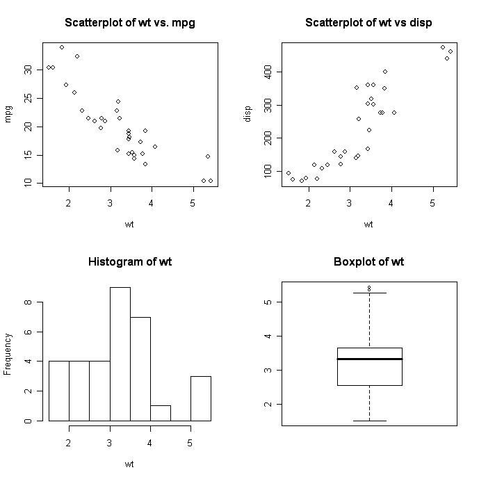
# 3 figures arranged in 3 rows and 1 column
attach(mtcars)
par(mfrow=c(3,1))
hist(wt)
hist(mpg)
hist(disp)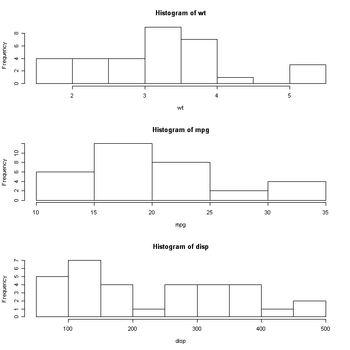
The layout( ) function has the form layout(mat) wheremat is a matrix object specifying the location of the N figures to plot.
# One figure in row 1 and two figures in row 2
attach(mtcars)
layout(matrix(c(1,1,2,3), 2, 2, byrow = TRUE))
hist(wt)
hist(mpg)
hist(disp)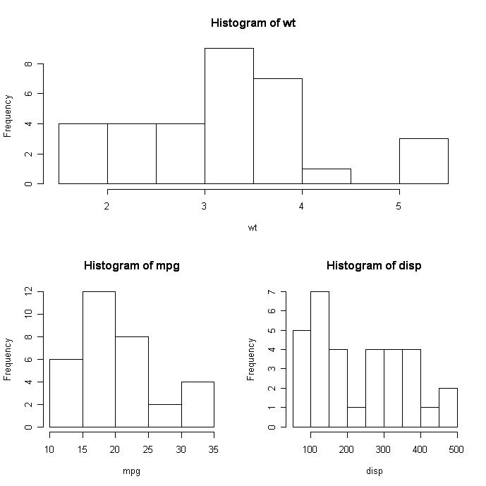
Optionally, you can include widths= and heights= options in the layout( ) function to control the size of each figure more precisely. These options have the formwidths= a vector of values for the widths of columnsheights= a vector of values for the heights of rows.
Relative widths are specified with numeric values. Absolute widths (in centimetres) are specified with the lcm() function.
# One figure in row 1 and two figures in row 2
# row 1 is 1/3 the height of row 2
# column 2 is 1/4 the width of the column 1
attach(mtcars)
layout(matrix(c(1,1,2,3), 2, 2, byrow = TRUE),
  widths=c(3,1), heights=c(1,2))
hist(wt)
hist(mpg)
hist(disp)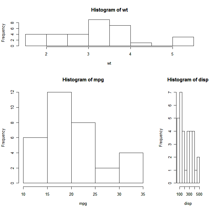
See help(layout) for more details.
Creating a figure arrangement with fine control
In the following example, two box plots are added to scatterplot to create an enhanced graph.
# Add boxplots to a scatterplot
par(fig=c(0,0.8,0,0.8), new=TRUE)
plot(mtcars$wt, mtcars$mpg, xlab="Car Weight",
  ylab="Miles Per Gallon")
par(fig=c(0,0.8,0.55,1), new=TRUE)
boxplot(mtcars$wt, horizontal=TRUE, axes=FALSE)
par(fig=c(0.65,1,0,0.8),new=TRUE)
boxplot(mtcars$mpg, axes=FALSE)
mtext("Enhanced Scatterplot", side=3, outer=TRUE, line=-3)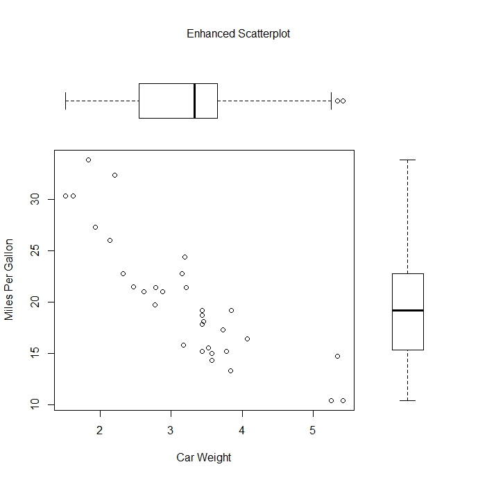
To understand this graph, think of the full graph area as going from (0,0) in the lower left corner to (1,1) in the upper right corner. The format of the fig= parameter is a numerical vector of the form c(x1, x2, y1, y2). The first fig= sets up the scatterplot going from 0 to 0.8 on the x axis and 0 to 0.8 on the y axis. The top boxplot goes from 0 to 0.8 on the x axis and 0.55 to 1 on the y axis. I chose 0.55 rather than 0.8 so that the top figure will be pulled closer to the scatter plot. The right hand boxplot goes from 0.65 to 1 on the x axis and 0 to 0.8 on the y axis. Again, I chose a value to pull the right hand boxplot closer to the scatterplot. You have to experiment to get it just right.
fig= starts a new plot, so to add to an existing plot use new=TRUE.
You can use this to combine several plots in any arrangement into one graph.
To Practice
Try the free first chapter of this interactive data visualization course, which covers combining plots.


blog
The 4 Best Data Analytics Bootcamps in 2024
Kevin Babitz
5 min
blog
A Guide to Corporate Data Analytics Training
Kevin Babitz
6 min

podcast
[Radar Recap] Scaling Data ROI: Driving Analytics Adoption Within Your Organization with Laura Gent Felker, Omar Khawaja and Tiffany Perkins-Munn

Richie Cotton
40 min
tutorial
How to Transpose a Matrix in R: A Quick Tutorial

Adel Nehme
code-along
Getting Started With Data Analysis in Alteryx Cloud

Joshua Burkhow