Scatterplot in R
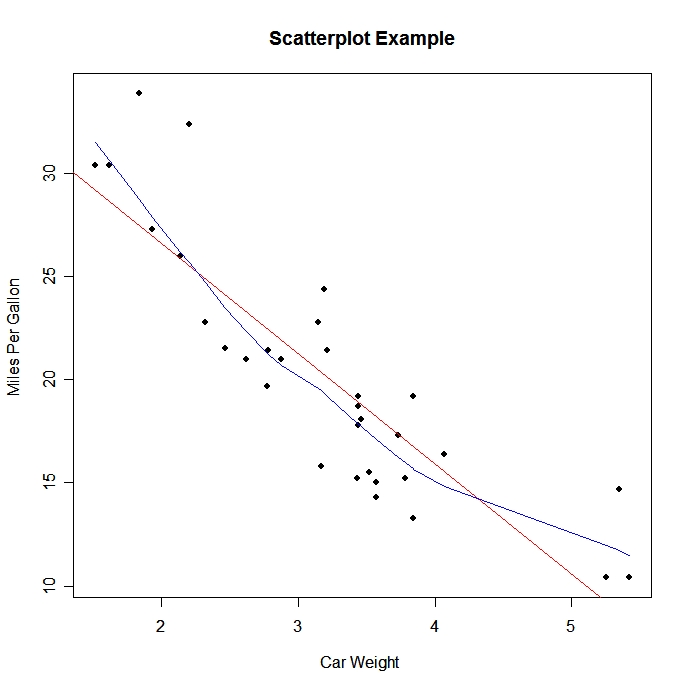
Simple Scatterplot
There are many ways to create a scatterplot in R. The basic function is plot(x , y), where x and y are numeric vectors denoting the (x,y) points to plot.
# Simple Scatterplot
attach(mtcars)
plot(wt, mpg, main="Scatterplot Example",
   xlab="Car Weight ", ylab="Miles Per Gallon ", pch=19)
(To practice making a simple scatterplot, try this interactive example from DataCamp.)
The scatterplot( ) function in the car package offers many enhanced features, including fit lines, marginal box plots, conditioning on a factor, and interactive point identification. Each of these features is optional.
# Enhanced Scatterplot of MPG vs. Weight
#by Number of Car Cylinders
library(car)

scatterplot(mpg ~ wt | cyl, data=mtcars,
   xlab="Weight of Car", ylab="Miles Per Gallon",
   main="Enhanced Scatter Plot",
   labels=row.names(mtcars))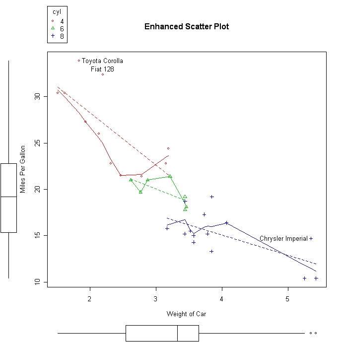
Scatterplot Matrices
There are at least 4 useful functions for creating scatterplot matrices. Analysts must love scatterplot matrices!
# Basic Scatterplot Matrix
pairs(~mpg+disp+drat+wt,data=mtcars,
   main="Simple Scatterplot Matrix")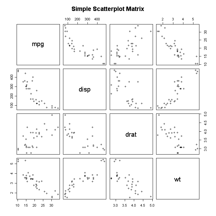
The latticepackage provides options to condition the scatterplot matrix on a factor.
# Scatterplot Matrices from the lattice Package

library(lattice)
splom(mtcars[c(1,3,5,6)], groups=cyl, data=mtcars,
   panel=panel.superpose,
   key=list(title="Three Cylinder Options",
   columns=3,
   points=list(pch=super.sym$pch[1:3],
   col=super.sym$col[1:3]),
   text=list(c("4 Cylinder","6 Cylinder","8 Cylinder"))))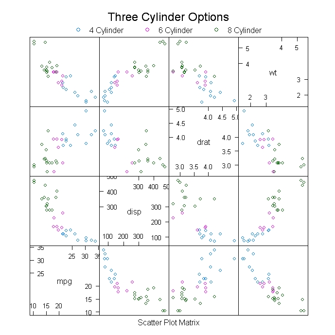
The car package can condition the scatterplot matrix on a factor, and optionally include lowess and linear best fit lines, and boxplot, densities, or histograms in the principal diagonal, as well as rug plots in the margins of the cells.
# Scatterplot Matrices from the car Package
library(car)
scatterplot.matrix(~mpg+disp+drat+wt|cyl, data=mtcars,
   main="Three Cylinder Options")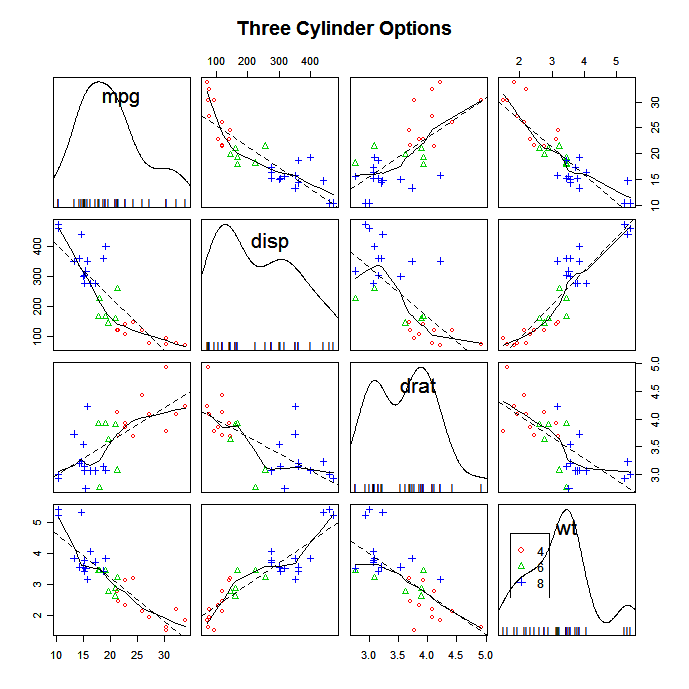
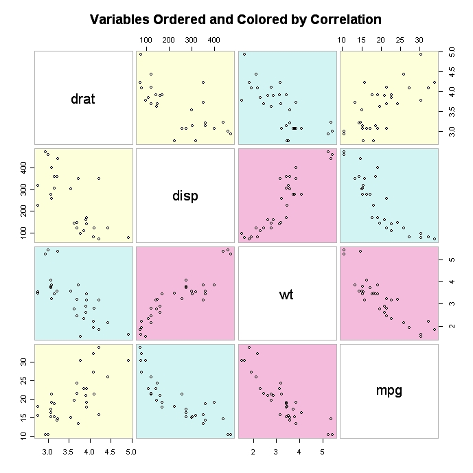
The gclus package provides options to rearrange the variables so that those with higher correlations are closer to the principal diagonal. It can also color code the cells to reflect the size of the correlations.
# Scatterplot Matrices from the glus Package

library(gclus)
dta <- mtcars[c(1,3,5,6)] # get data
dta.r <- abs(cor(dta)) # get correlations
dta.col <- dmat.color(dta.r) # get colors
# reorder variables so those with highest correlation
# are closest to the diagonal
dta.o <- order.single(dta.r)

cpairs(dta, dta.o, panel.colors=dta.col, gap=.5,
main="Variables Ordered and Colored by Correlation"
)
High Density Scatterplots
When there are many data points and significant overlap, scatterplots become less useful. There are several approaches that be used when this occurs. The hexbin(x, y) function in the hexbin package provides bivariate binning into hexagonal cells (it looks better than it sounds).
# High Density Scatterplot with Binning
library(hexbin)
x <- rnorm(1000)
y <- rnorm(1000)
bin<-hexbin(x, y, xbins=50)

plot(bin, main="Hexagonal Binning")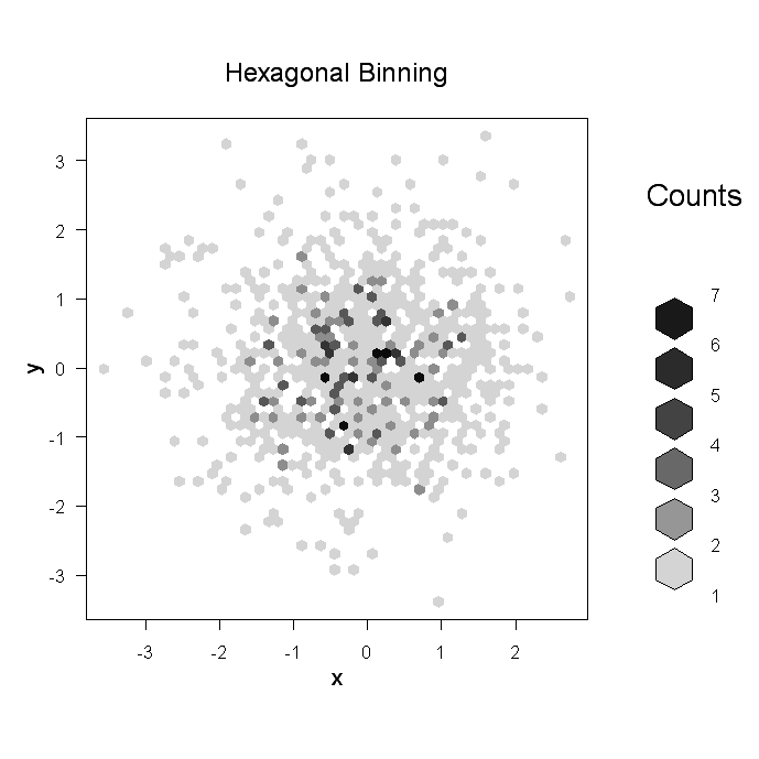
Another option for a scatterplot with significant point overlap is the sunflowerplot. See help(sunflowerplot) for details.
Finally, you can save the scatterplot in PDF format and use color transparency to allow points that overlap to show through (this idea comes from B.S. Everrit in HSAUR).
# High Density Scatterplot with Color Transparency
pdf("c:/scatterplot.pdf")

x <- rnorm(1000)
y <- rnorm(1000)

plot(x,y, main="PDF Scatterplot Example", col=rgb(0,100,0,50,maxColorValue=255), pch=16)
dev.off()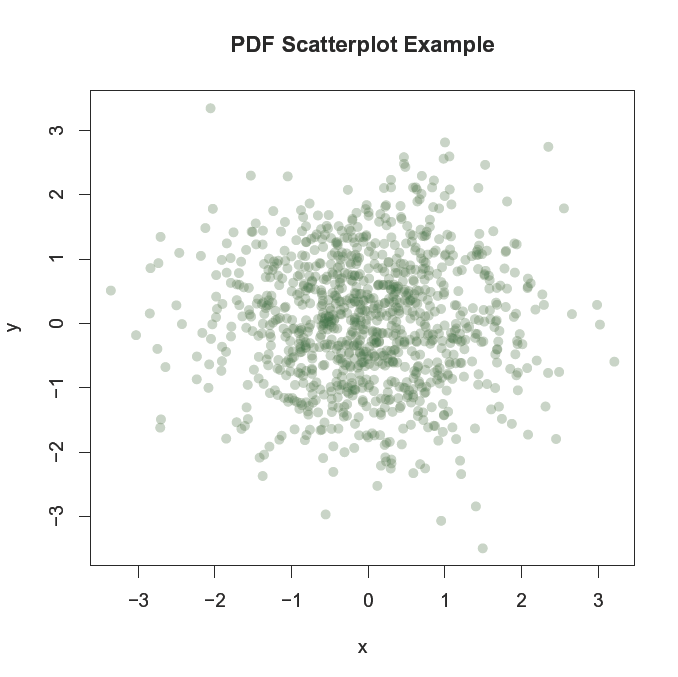
Note: You can use the col2rgb( ) function to get the rbg values for R colors. For example, col2rgb("darkgreen") yeilds r=0, g=100, b=0. Then add the alpha transparency level as the 4th number in the color vector. A value of zero means fully transparent. See help(rgb) for more information.
3D Scatterplots
You can create a 3D scatterplot with the scatterplot3d package. Use the function scatterplot3d(x , y , z).
# 3D Scatterplot
library(scatterplot3d)
attach(mtcars)
scatterplot3d(wt,disp,mpg, main="3D Scatterplot")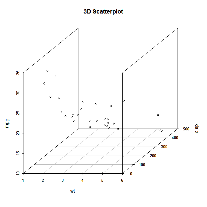
# 3D Scatterplot with Coloring and Vertical Drop Lines
library(scatterplot3d)
attach(mtcars)
scatterplot3d(wt,disp,mpg, pch=16, highlight.3d=TRUE,
  type="h", main="3D Scatterplot")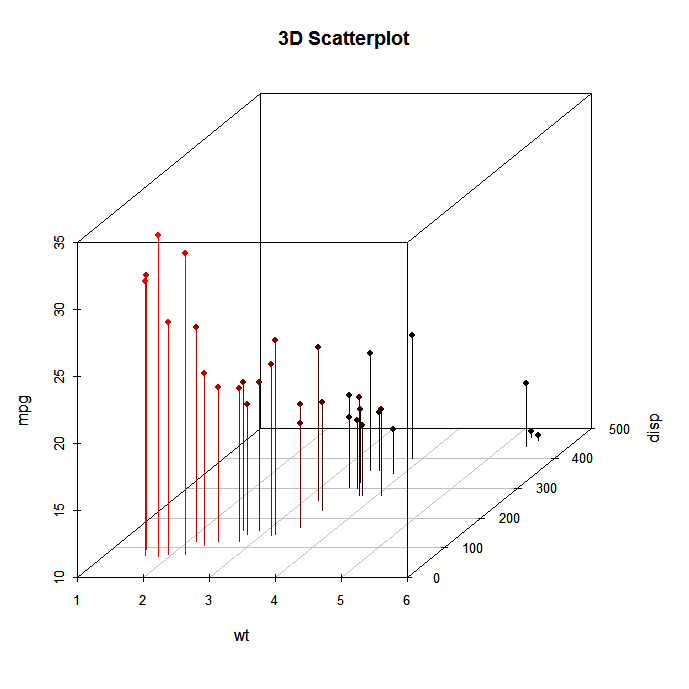
# 3D Scatterplot with Coloring and Vertical Lines
# and Regression Plane
library(scatterplot3d)
attach(mtcars)
s3d <-scatterplot3d(wt,disp,mpg, pch=16, highlight.3d=TRUE,
  type="h", main="3D Scatterplot")
fit <- lm(mpg ~ wt+disp)
s3d$plane3d(fit)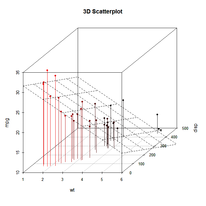
Spinning 3D Scatterplots
You can also create an interactive 3D scatterplot using the plot3D(x , y , z) function in the rgl package. It creates a spinning 3D scatterplot that can be rotated with the mouse. The first three arguments are the x, y, and z numeric vectors representing points. col= and size= control the color and size of the points respectively.
# Spinning 3d Scatterplot
library(rgl)

plot3d(wt, disp, mpg, col="red", size=3)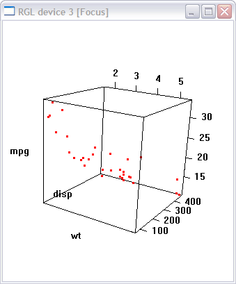
You can perform a similar function with the scatter3d(x , y , z) in the Rcmdr package.
# Another Spinning 3d Scatterplot
library(Rcmdr)
attach(mtcars)
scatter3d(wt, disp, mpg)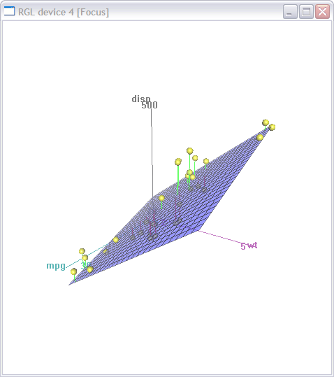
To Practice
Try the creating scatterplot exercises in this course on data visualization in R.


blog
The 4 Best Data Analytics Bootcamps in 2024
Kevin Babitz
5 min
blog
A Guide to Corporate Data Analytics Training
Kevin Babitz
6 min

podcast
[Radar Recap] Scaling Data ROI: Driving Analytics Adoption Within Your Organization with Laura Gent Felker, Omar Khawaja and Tiffany Perkins-Munn

Richie Cotton
40 min
tutorial
How to Transpose a Matrix in R: A Quick Tutorial

Adel Nehme
code-along
Getting Started With Data Analysis in Alteryx Cloud

Joshua Burkhow