Graphics with ggplot2
The ggplot2 package, created by Hadley Wickham, offers a powerful graphics language for creating elegant and complex plots. Its popularity in the R community has exploded in recent years. Origianlly based on Leland Wilkinson's The Grammar of Graphics, ggplot2 allows you to create graphs that represent both univariate and multivariate numerical and categorical data in a straightforward manner. Grouping can be represented by color, symbol, size, and transparency. The creation of trellis plots (i.e., conditioning) is relatively simple.
Mastering the ggplot2 language can be challenging (see the Going Further section below for helpful resources). There is a helper function called qplot() (for quick plot) that can hide much of this complexity when creating standard graphs.
qplot()
The qplot() function can be used to create the most common graph types. While it does not expose ggplot's full power, it can create a very wide range of useful plots. The format is:
qplot(x, y, data=, color=, shape=, size=, alpha=, geom=, method=,
  formula=, facets=, xlim=, ylim= xlab=, ylab=, main=, sub=)
where the options are:
| option | description |
| alpha | Alpha transparency for overlapping elements expressed as a fraction between 0 (complete transparency) and 1 (complete opacity) |
| color, shape, size, fill | Associates the levels of variable with symbol color, shape, or size. For line plots, color associates levels of a variable with line color. For density and box plots, fill associates fill colors with a variable. Legends are drawn automatically. |
| data | Specifies a data frame |
| facets | Creates a trellis graph by specifying conditioning variables. Its value is expressed as rowvar ~ colvar. To create trellis graphs based on a single conditioning variable, use rowvar~. or .~colvar) |
| geom | Specifies the geometric objects that define the graph type. The geom option is expressed as a character vector with one or more entries. geom values include "point", "smooth", "boxplot", "line", "histogram", "density", "bar", and "jitter". |
| main, sub | Character vectors specifying the title and subtitle |
| method, formula | If geom="smooth", a loess fit line and confidence limits are added by default. When the number of observations is greater than 1,000, a more efficient smoothing algorithm is employed. Methods include "lm" for regression, "gam" for generalized additive models, and "rlm" for robust regression. The formula parameter gives the form of the fit. For example, to add simple linear regression lines, you'd specify geom="smooth", method="lm", formula=y~x. Changing the formula to y~poly(x,2) would produce a quadratic fit. Note that the formula uses the letters x and y, not the names of the variables. For method="gam", be sure to load the mgcv package. For method="rml", load the MASS package. |
| x, y | Specifies the variables placed on the horizontal and vertical axis. For univariate plots (for example, histograms), omit y |
| xlab, ylab | Character vectors specifying horizontal and vertical axis labels |
| xlim,ylim | Two-element numeric vectors giving the minimum and maximum values for the horizontal and vertical axes, respectively |
Notes:
- At present, ggplot2 cannot be used to create 3D graphs or mosaic plots.
- Use I(value) to indicate a specific value. For example size=z makes the size of the plotted points or lines proporational to the values of a variable z. In contrast, size=I(3) sets each point or line to three times the default size.
Here are some examples using automotive data (car mileage, weight, number of gears, number of cylinders, etc.) contained in the mtcars data frame.
# ggplot2 examples
library(ggplot2)
# create factors with value labels
mtcars$gear <- factor(mtcars$gear,levels=c(3,4,5),
labels=c("3gears","4gears","5gears"))
mtcars$am <- factor(mtcars$am,levels=c(0,1),
labels=c("Automatic","Manual"))
mtcars$cyl <- factor(mtcars$cyl,levels=c(4,6,8),
labels=c("4cyl","6cyl","8cyl"))
# Kernel density plots for mpg
# grouped by number of gears (indicated by color)
qplot(mpg, data=mtcars, geom="density", fill=gear, alpha=I(.5),
main="Distribution of Gas Milage", xlab="Miles Per Gallon",
ylab="Density")
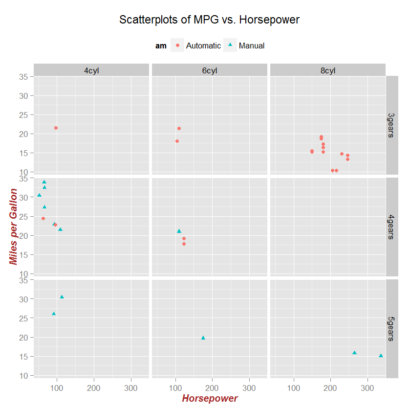
# Scatterplot of mpg vs. hp for each combination of gears and cylinders
# in each facet, transmittion type is represented by shape and color
qplot(hp, mpg, data=mtcars, shape=am, color=am,
facets=gear~cyl, size=I(3),
xlab="Horsepower", ylab="Miles per Gallon")
# Separate regressions of mpg on weight for each number of cylinders
qplot(wt, mpg, data=mtcars, geom=c("point", "smooth"),
method="lm", formula=y~x, color=cyl,
main="Regression of MPG on Weight",
xlab="Weight", ylab="Miles per Gallon")
# Boxplots of mpg by number of gears
# observations (points) are overlayed and jittered
qplot(gear, mpg, data=mtcars, geom=c("boxplot", "jitter"),
fill=gear, main="Mileage by Gear Number",
xlab="", ylab="Miles per Gallon")


click to view
Customizing ggplot2 Graphs
Unlike base R graphs, the ggplot2 graphs are not effected by many of the options set in the par( ) function. They can be modified using the theme() function, and by adding graphic parameters within the qplot() function. For greater control, use ggplot() and other functions provided by the package. Note that ggplot2 functions can be chained with "+" signs to generate the final plot.
library(ggplot2)

p <- qplot(hp, mpg, data=mtcars, shape=am, color=am,
   facets=gear~cyl, main="Scatterplots of MPG vs. Horsepower",
   xlab="Horsepower", ylab="Miles per Gallon")

# White background and black grid lines
p + theme_bw()

# Large brown bold italics labels
# and legend placed at top of plot
p + theme(axis.title=element_text(face="bold.italic",
   size="12", color="brown"), legend.position="top")
 click to view
Going Further
We have only scratched the surface here. To learn more, see this handy ggplot cheat sheet, and Winston Chang's excellent Cookbook for R site. Though slightly out of date, ggplot2: Elegant Graphics for Data Anaysis is still the definative book on this subject.
To Practice
Try the free first chapter of this interactive tutorial on ggplot2.