Line Charts
Overview
Line charts are created with the function lines(x , y, type=) where x and y are numeric vectors of (x,y) points to connect. type= can take the following values:
| type | description |
| p | points |
| l | lines |
| o | overplotted points and lines |
| b, c | points (empty if "c") joined by lines |
| s, S | stair steps |
| h | histogram-like vertical lines |
| n | does not produce any points or lines |
The lines( ) function adds information to a graph. It can not produce a graph on its own. Usually it follows a plot(x , y) command that produces a graph.
By default, plot( ) plots the (x,y) points. Use the type="n" option in the plot( ) command, to create the graph with axes, titles, etc., but without plotting the points.
Example
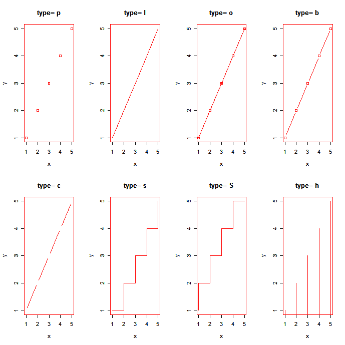
In the following code each of the type= options is applied to the same dataset. The plot( ) command sets up the graph, but does not plot the points.
x <- c(1:5); y <- x # create some data
par(pch=22, col="red") # plotting symbol and color
par(mfrow=c(2,4)) # all plots on one page
opts = c("p","l","o","b","c","s","S","h")
for(i in 1:length(opts)){
  heading = paste("type=",opts[i])
  plot(x, y, type="n", main=heading)
  lines(x, y, type=opts[i])
}
 click to view
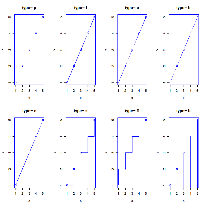
Next, we demonstrate each of the type= options when plot( ) sets up the graph and _ does _ plot the points.
x <- c(1:5); y <- x # create some data
par(pch=22, col="blue") # plotting symbol and color
par(mfrow=c(2,4)) # all plots on one page
opts = c("p","l","o","b","c","s","S","h")
for(i in 1:length(opts){
  heading = paste("type=",opts[i])
  plot(x, y, main=heading)
  lines(x, y, type=opts[i])
}
 click to view
As you can see, the type="c" option only looks different from the type="b" option if the plotting of points is suppressed in the plot( ) command.
To demonstrate the creation of a more complex line chart, let's plot the growth of 5 orange trees over time. Each tree will have its own distinctive line. The data come from the dataset Orange.
# Create Line Chart

# convert factor to numeric for convenience
Orange$Tree <- as.numeric(Orange$Tree)
ntrees <- max(Orange$Tree)

# get the range for the x and y axis
xrange <- range(Orange$age)
yrange <- range(Orange$circumference)

# set up the plot
plot(xrange, yrange, type="n", xlab="Age (days)",
   ylab="Circumference (mm)" )
colors <- rainbow(ntrees)
linetype <- c(1:ntrees)
plotchar <- seq(18,18+ntrees,1)

# add lines
for (i in 1:ntrees) {
  tree <- subset(Orange, Tree==i)
  lines(tree$age, tree$circumference, type="b", lwd=1.5,
    lty=linetype[i], col=colors[i], pch=plotchar[i])
}

# add a title and subtitle
title("Tree Growth", "example of line plot")

# add a legend
legend(xrange[1], yrange[2], 1:ntrees, cex=0.8, col=colors,
   pch=plotchar, lty=linetype, title="Tree")
 click to view
Going Further
Try the exercises in this course on plotting and data visualization in R.