Pie Charts
According to the R documentation, pie charts are not recommended and have limited features. The authors suggest using bar or dot plots instead, as people can accurately judge length better than volume. To create a pie chart in R, use the function pie(x, labels=) where x is a non-negative numeric vector indicating the area of each slice and labels= is a character vector specifying names for the slices.
Below are some examples of pie charts you can create with different formats and annotations.
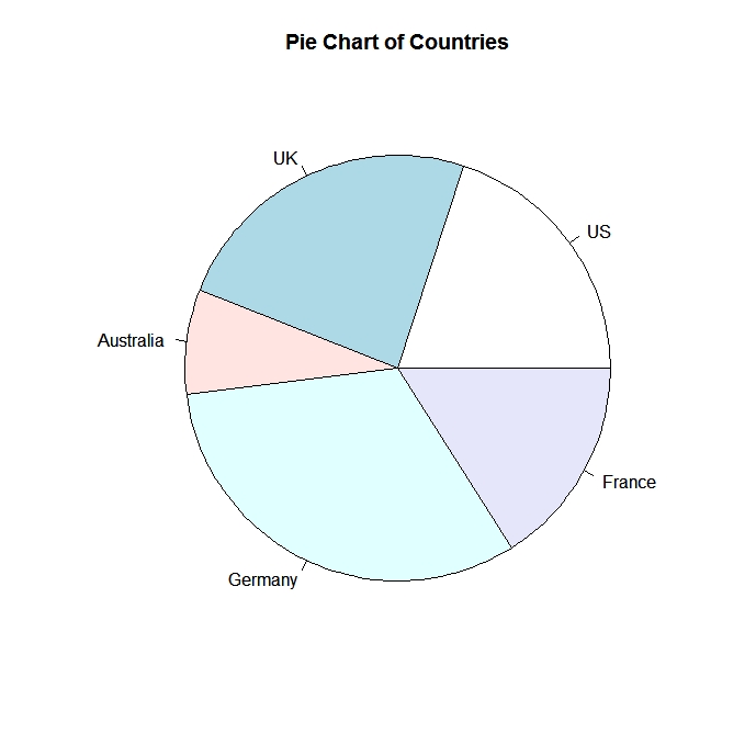
Simple Pie Chart
# Simple Pie Chart
slices <- c(10, 12,4, 16, 8)
lbls <- c("US", "UK", "Australia", "Germany", "France")
pie(slices, labels = lbls, main="Pie Chart of Countries")
 click to view
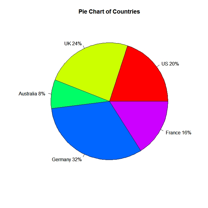
Pie Chart with Annotated Percentages
# Pie Chart with Percentages
slices <- c(10, 12, 4, 16, 8)

lbls <- c("US", "UK", "Australia", "Germany", "France")
pct <- round(slices/sum(slices)*100)
lbls <- paste(lbls, pct)
# add percents to labels
lbls <- paste(lbls,"%",sep="") # ad % to labels
pie(slices,labels = lbls, col=rainbow(length(lbls)),
   main="Pie Chart of Countries")
 click to view
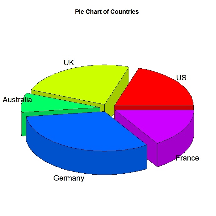
3D Pie Chart
The pie3D( ) function in the plotrix package provides 3D exploded pie charts.
# 3D Exploded Pie Chart
library(plotrix)
slices <- c(10, 12, 4, 16, 8)
lbls <- c("US", "UK", "Australia", "Germany", "France")
pie3D(slices,labels=lbls,explode=0.1,
   main="Pie Chart of Countries ")
 click to view
Creating Annotated Pies from a data frame
# Pie Chart from data frame with Appended Sample Sizes
mytable <- table(iris$Species)
lbls <- paste(names(mytable), "\n", mytable, sep="")
pie(mytable, labels = lbls,
   main="Pie Chart of Species\n (with sample sizes)")
 click to view